
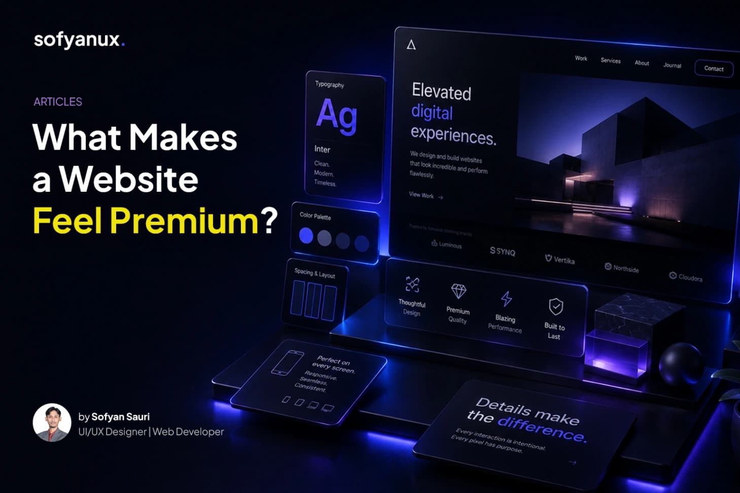
# What Makes a Website Feel Premium?
A premium website does not always need heavy animation, expensive visuals, or complicated effects.
In many cases, a website feels premium because it is clear, consistent, and well-composed. The design feels intentional. The spacing feels balanced. The typography feels confident. The content feels easy to follow.
Premium design is often about restraint.
## Strong typography
Typography has a huge impact on how a website feels.
Large headings, readable body text, consistent line height, and proper spacing can make a website look more mature and professional.
A premium website usually does not use too many font styles. It keeps the system simple and lets the content breathe.
## Generous whitespace
Whitespace is not empty space. It is part of the design.
Good spacing helps separate sections, improve readability, and make important content stand out. When everything is too close together, the website can feel crowded and unfinished.
A premium layout gives each element enough room to feel intentional.
## Consistent visual system
Consistency makes a website feel reliable.
Buttons, cards, headings, tags, images, and sections should follow the same design language. When each component looks like it belongs to the same system, the whole website feels more polished.
## Clear content hierarchy
A premium website guides attention.
Users should quickly know what to read first, what is supporting information, and what action they can take next. This is done through size, weight, spacing, contrast, and layout.
## Final thoughts
A premium website is not defined by how many visual effects it has.
It is defined by how well everything works together.
Clarity, spacing, typography, consistency, and restraint are often what make a website feel truly refined.

# What Makes a Website Feel Premium?
A premium website does not always need heavy animation, expensive visuals, or complicated effects.
In many cases, a website feels premium because it is clear, consistent, and well-composed. The design feels intentional. The spacing feels balanced. The typography feels confident. The content feels easy to follow.
Premium design is often about restraint.
## Strong typography
Typography has a huge impact on how a website feels.
Large headings, readable body text, consistent line height, and proper spacing can make a website look more mature and professional.
A premium website usually does not use too many font styles. It keeps the system simple and lets the content breathe.
## Generous whitespace
Whitespace is not empty space. It is part of the design.
Good spacing helps separate sections, improve readability, and make important content stand out. When everything is too close together, the website can feel crowded and unfinished.
A premium layout gives each element enough room to feel intentional.
## Consistent visual system
Consistency makes a website feel reliable.
Buttons, cards, headings, tags, images, and sections should follow the same design language. When each component looks like it belongs to the same system, the whole website feels more polished.
## Clear content hierarchy
A premium website guides attention.
Users should quickly know what to read first, what is supporting information, and what action they can take next. This is done through size, weight, spacing, contrast, and layout.
## Final thoughts
A premium website is not defined by how many visual effects it has.
It is defined by how well everything works together.
Clarity, spacing, typography, consistency, and restraint are often what make a website feel truly refined.

